
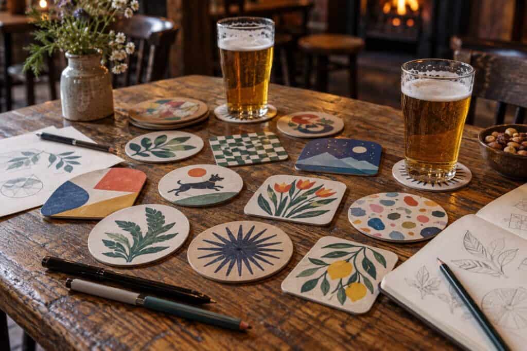
Create Eye-Catching Artwork With DIY Beer Mat Designs
Designing your own beer mats for bars, breweries, events and businesses is fun and surprisingly economical. A great little item for distribution at your bar, brewery, event or business, beer mats are something many people take home with them. In this article we explain the design of beer mats in a little more detail and look at how to design an effective, good-looking mat that prints well.
Start with a strong concept
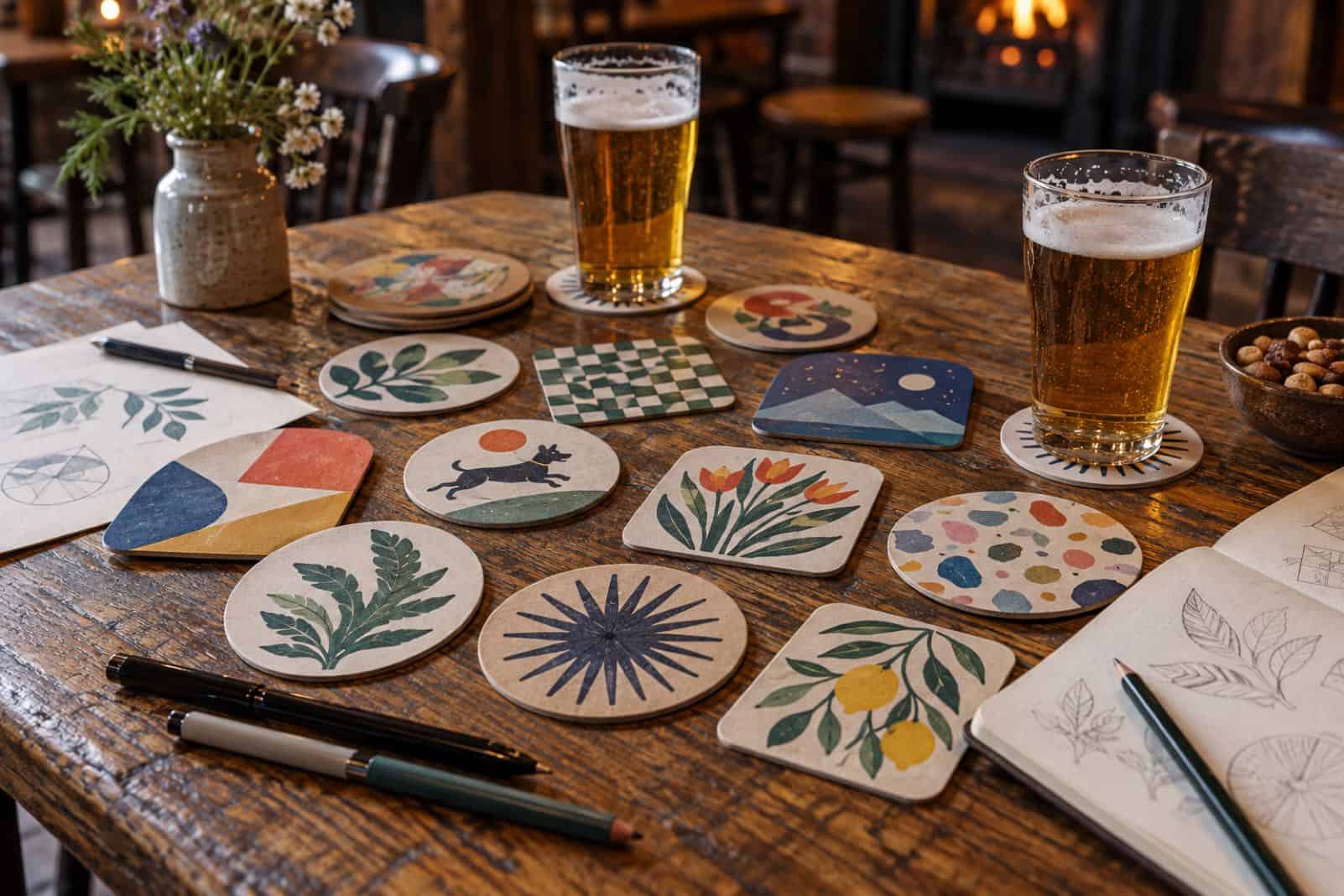
Start sketching your idea for a beer mat design before you fire up any design software. What are you trying to get across with the design? Are you launching a new beer, promoting a recurring event, trying to drive interest in a special offer or simply building awareness of your brand in general?
Keep it simple and bold
Beer mats are small, and they are usually seen on a busy table, often from across it. Avoid thin lines, small type and crowded detail. Simple, bold designs are easier to remember and reproduce better in print. For Personalised Beer Mats, visit //wedoprinting.ie/product/custom-printed-beermats/
Choose a strong colour palette
Colour will draw people to your mat and set the mood. Choose 2-3 colours that reflect your brand, and make sure there is high contrast between the background and text so it is easily readable from afar and in poor bar lighting. Uncoated board absorbs ink, so colours may look slightly washed out in print compared to the on-screen version.
Put readability first
Keep your wording brief: a name, a line and possibly a website address or QR code. The text should be readable in a single glance. You can choose a font which suits your personality and is either formal or playful. Do not use a decorative font as it will not read well at a small size.
Build a clear visual hierarchy
Use size and space to guide the eye. Key information on your brand (such as the name) and dates of event should stand out first. Secondary details come next. A clear order means people take in the most important message even if they only look for a second.
Use quality images
Use high resolution photos and/or illustrations that are relevant to the message. Low quality images will print up blurry and make the whole design look cheap.
Get the print details right
| Check | Why it matters |
|---|---|
| Shape and size | Round and square mats need different layouts |
| Bleed | Extend the background past the cut line so no white edges appear |
| Safe area | Keep text away from the edges, which can be trimmed or worn |
| Colour mode | Supply artwork in the format your printer asks for, usually CMYK |
| Both sides | Use the back for a second message, offer or QR code |
Test your design
Print out a test version of your layout at the exact size it will be in print, then view it on a flat surface, from a normal seated distance, and in poor lighting. Does your main message get across? Is your text readable? Show your test to a few people who have not seen it before, and ask them what they notice first. Make any necessary changes based on what you learn before ordering a full run.
Frequently asked questions
What is the best shape for a beer mat?
The most common mat type and least expensive to produce are round and square mats. Although unusual custom shapes can be eye-catching, most cost more to produce and require a special cutting die. A well-designed round or square mat is usually the best value for most companies.
Should I put a QR code on a beer mat?
QR codes can be placed on the back of the mat and lead to a specific page such as a menu, booking page or offer. Ensure that the QR code is large enough to be scanned easily, give people a reason to scan it and test on various phones before printing.
Where to go next
Planning other printed materials too? See our guide to how long folded leaflet printing takes to plan your timings.
