
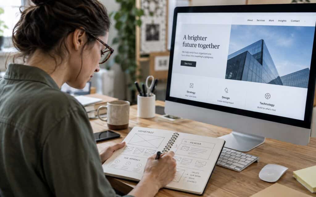
Six Tips for Designing a Great Corporate Homepage
Your corporate homepage is often the first contact that your potential clients, business partners, investors and even job seekers have with you and your company. In a few seconds they should get a good idea of who you are and what you can do for them. By making a good first impression your homepage builds trust, encourages users to find out more and motivates them to take action. These 6 tips will help your homepage to work for your business.
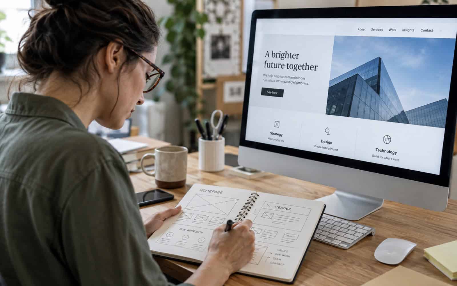
1. Communicate your value
State the obvious: make it clear straight away what you do and why you matter to your visitors. Your homepage headline and value proposition should be short and clear, above the fold. This type of messaging is best served up in clear, straightforward language focused on benefits, with a proper visual hierarchy to back it up.
2. Keep navigation simple
Key pages (e.g. services, about, contact) should be accessible within one or two clicks. Use short and familiar menu labels, keep the menu the same across all devices and avoid unnecessary layers. Consider adding a search box to larger websites.
3. Avoid clutter
Keep it simple. A clean design with plenty of white space enables users to focus on what you want to communicate. Resisting the temptation to include everything on the homepage, selecting the key messages that you wish to promote and linking to full details help to ensure that they stand out.
4. Use quality visuals
High-quality images or videos can strengthen your homepage. However, they must be authentic and relevant. Stock photos are often too overused and make a business look generic. Original photos of your team, your work and your premises are usually more effective at building trust with your website visitors. Make sure to optimise the files so that your homepage still loads quickly.
5. Make it mobile-friendly
A large share of visitors now arrive on phones, so your homepage must load quickly and work well on every screen size. Search engines also take mobile usability into account. Many specialists in web design Exeter make mobile optimisation a central part of their builds. Here you can read more about making your website mobile-friendly.
6. Use clear calls to action
Guide visitors with clear, purposeful calls to action, whether that is “Get in touch”, “Request a quote” or “See our work”. Make the main action stand out visually. Agencies such as //exeter.nettl.com/web-design/ often use repeated CTAs throughout the page to encourage engagement.
Homepage checklist
| Element | Ask yourself |
|---|---|
| Headline | Would a new visitor know what we do in five seconds? |
| Navigation | Can people reach key pages in one or two clicks? |
| Trust | Are there reviews, client logos, accreditations or case studies? |
| Speed | Does the page load quickly on a phone? |
| Action | Is the next step obvious? |
Frequently asked questions
How long should a corporate homepage be?
Long enough to describe what you do, to explain why your customers should trust you and to tell them what to do next, and no longer. There are many good examples of effective homepages, typically opening with a strong introduction followed by short sections outlining services, examples or proof of previous work in the form of case studies or customer reviews, and a clear call to action.
How often should a homepage be updated?
Review your homepage at least every few months, or whenever your services, focus and key messages change. New case studies, recent news and results help prove activity, while checking links and the loading time of your website keeps it working well.
Where to go next
Structure matters as much as design. Read how to organise website content so visitors find what they need.
Great web design combines design, functionality and business objectives. A well-designed homepage can make a lasting impression and deliver results for your business.
